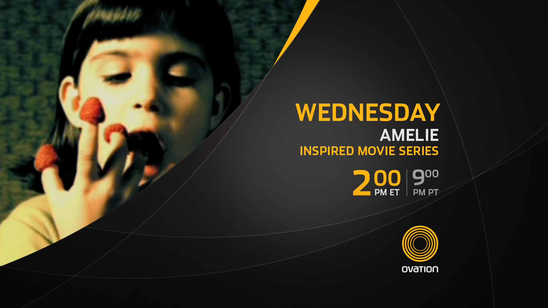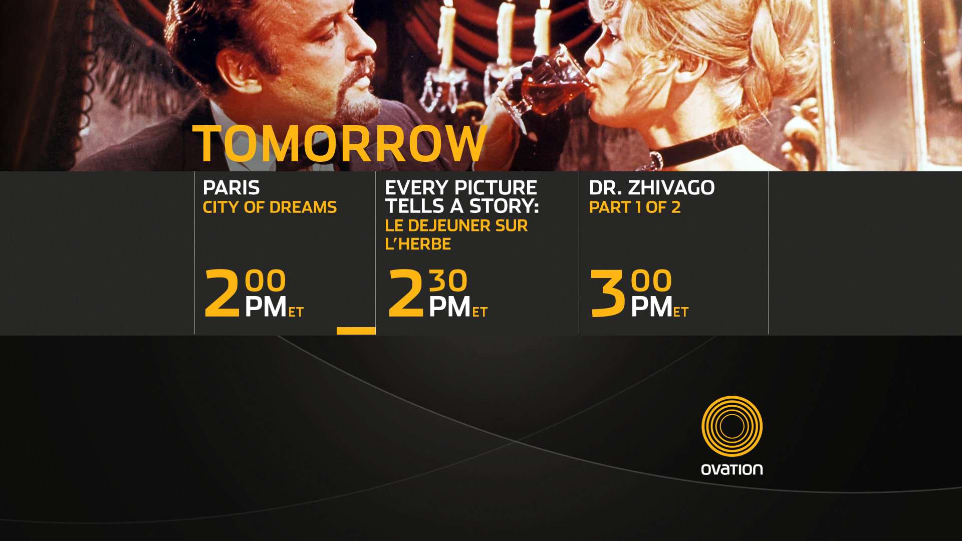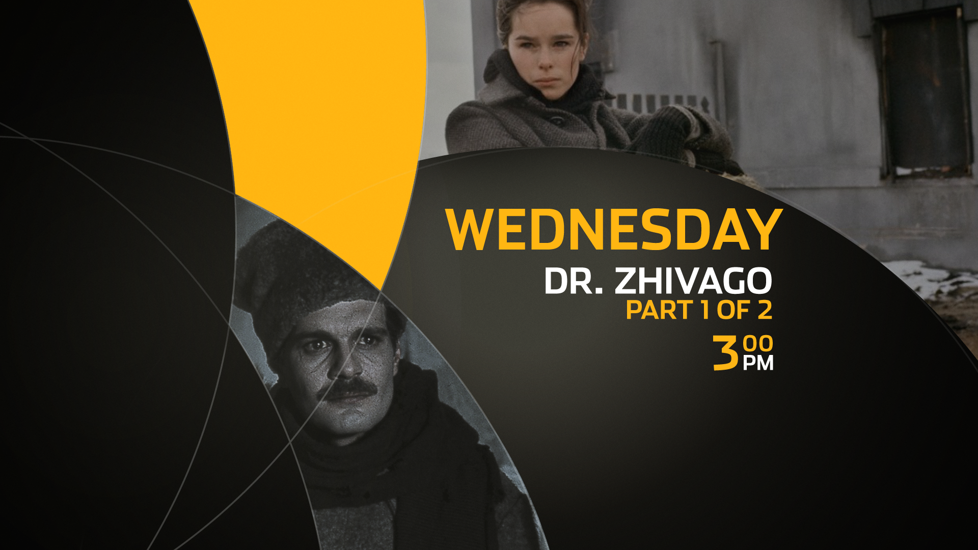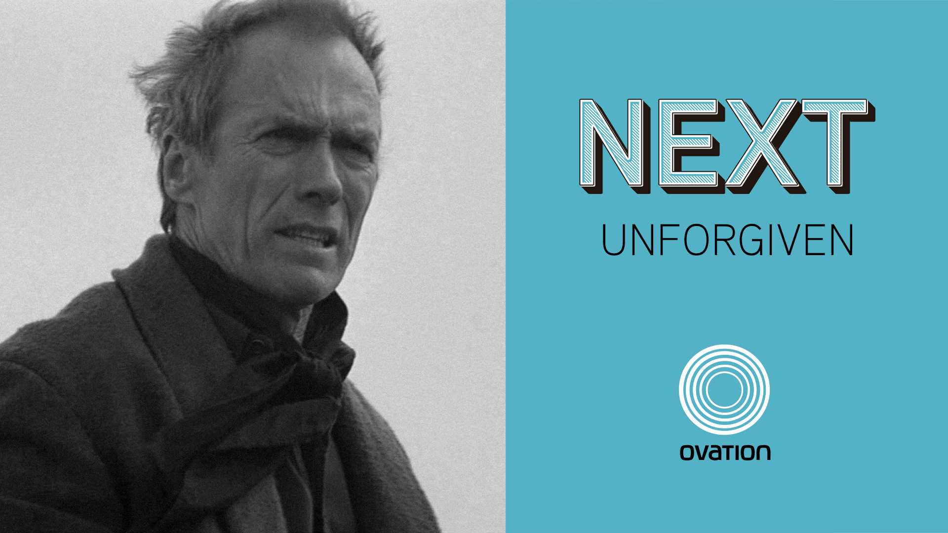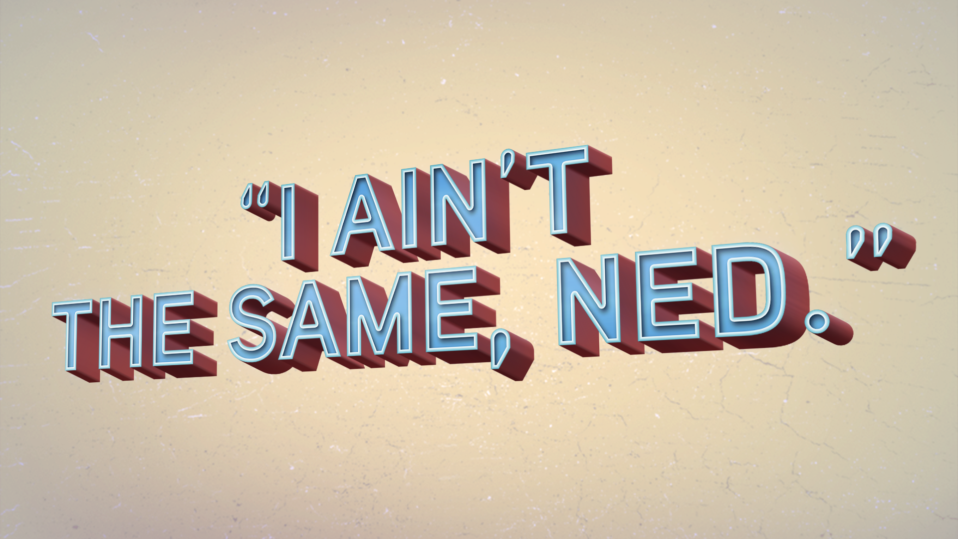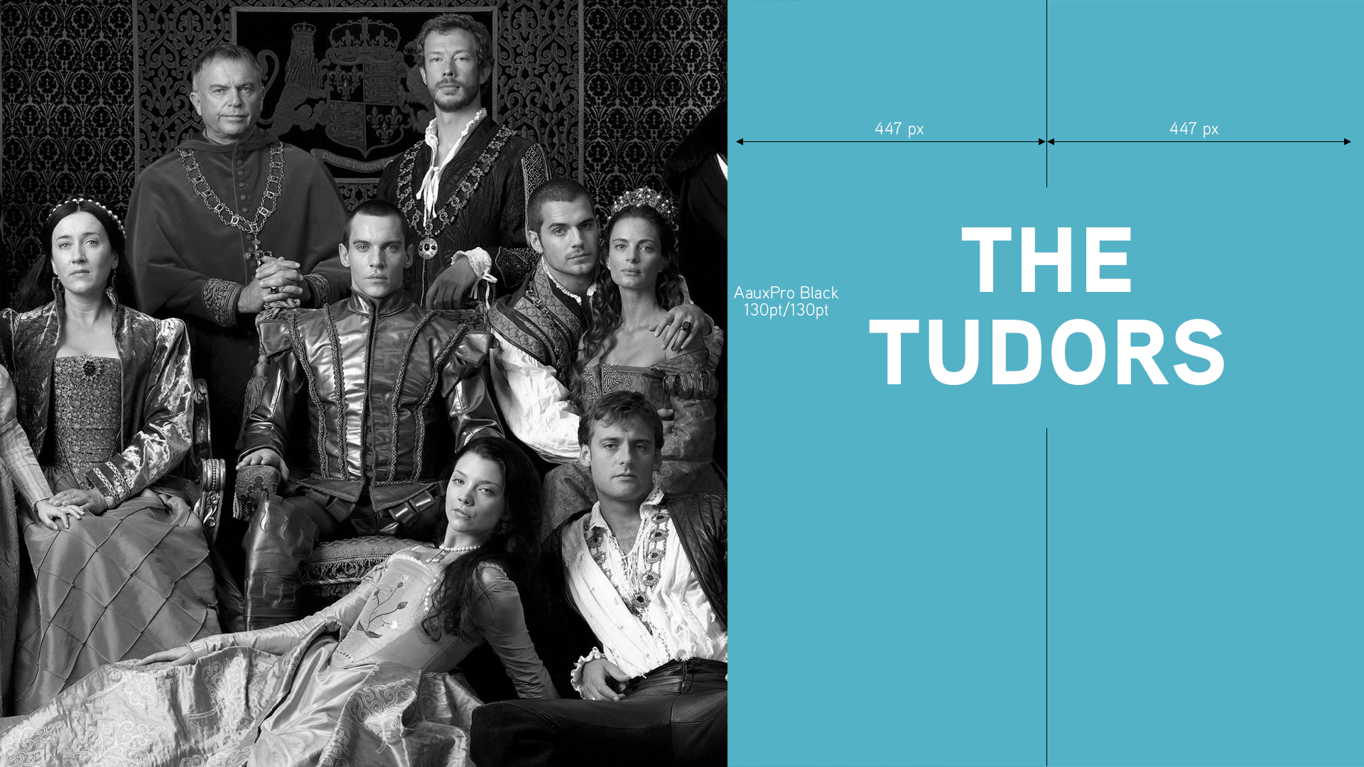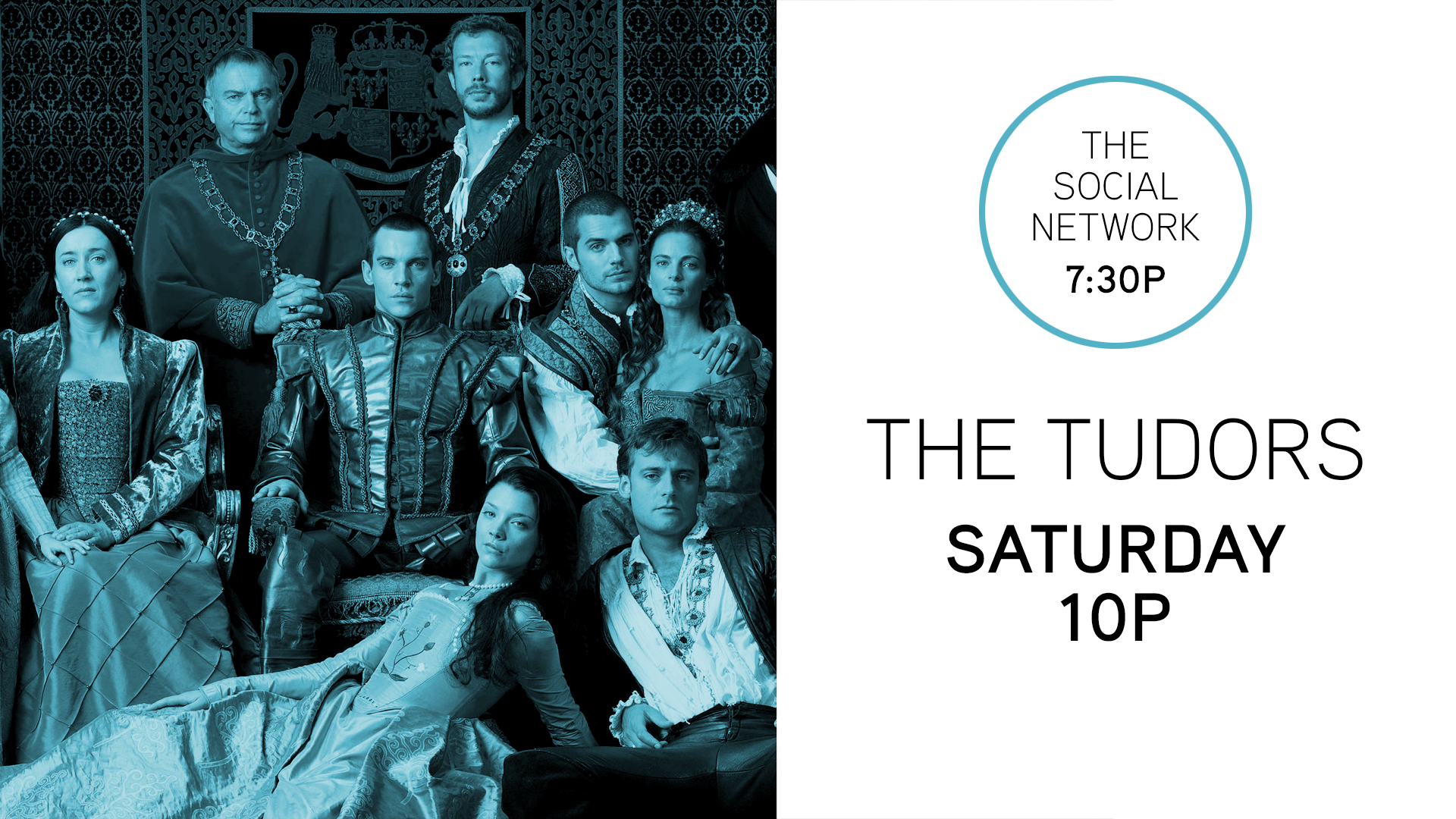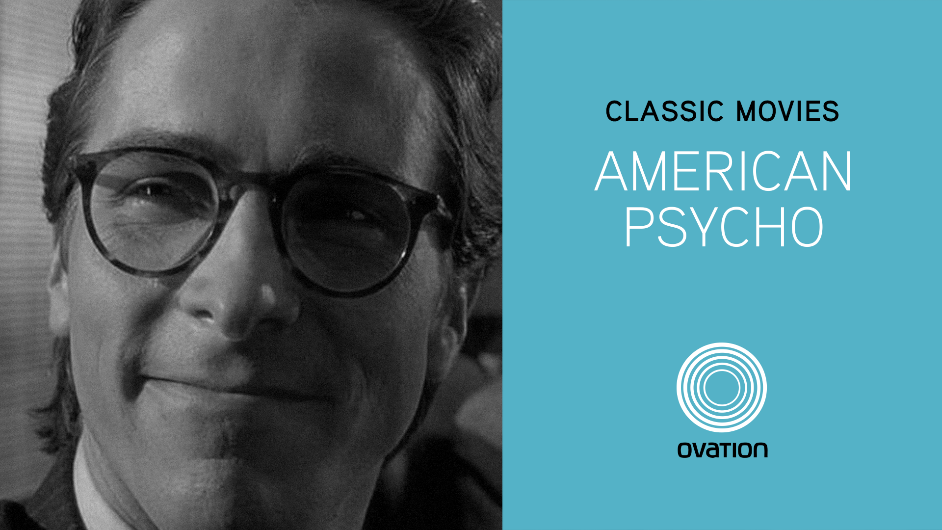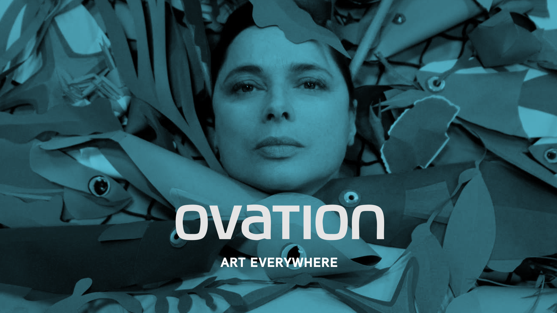
Ovation wanted to change up its iconic logo and branding color palette from yellow to blue, while refreshing its brand image. I worked on a refresh pitch that allowed the design team some flexibility while giving the network a stronger voice.
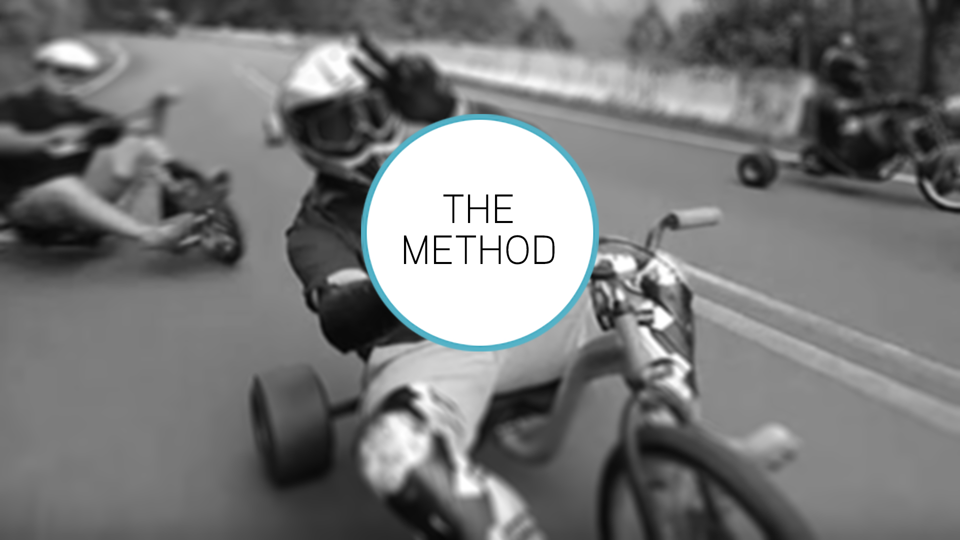
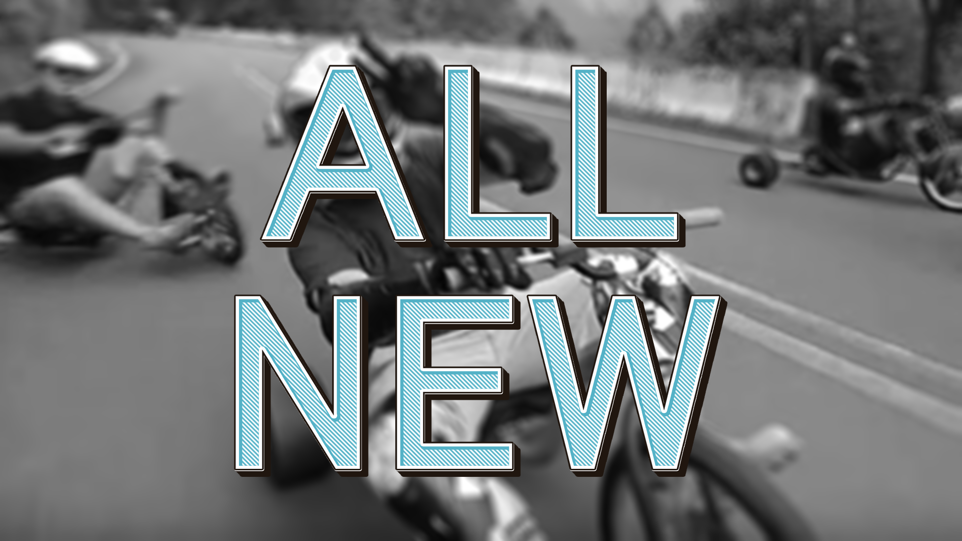
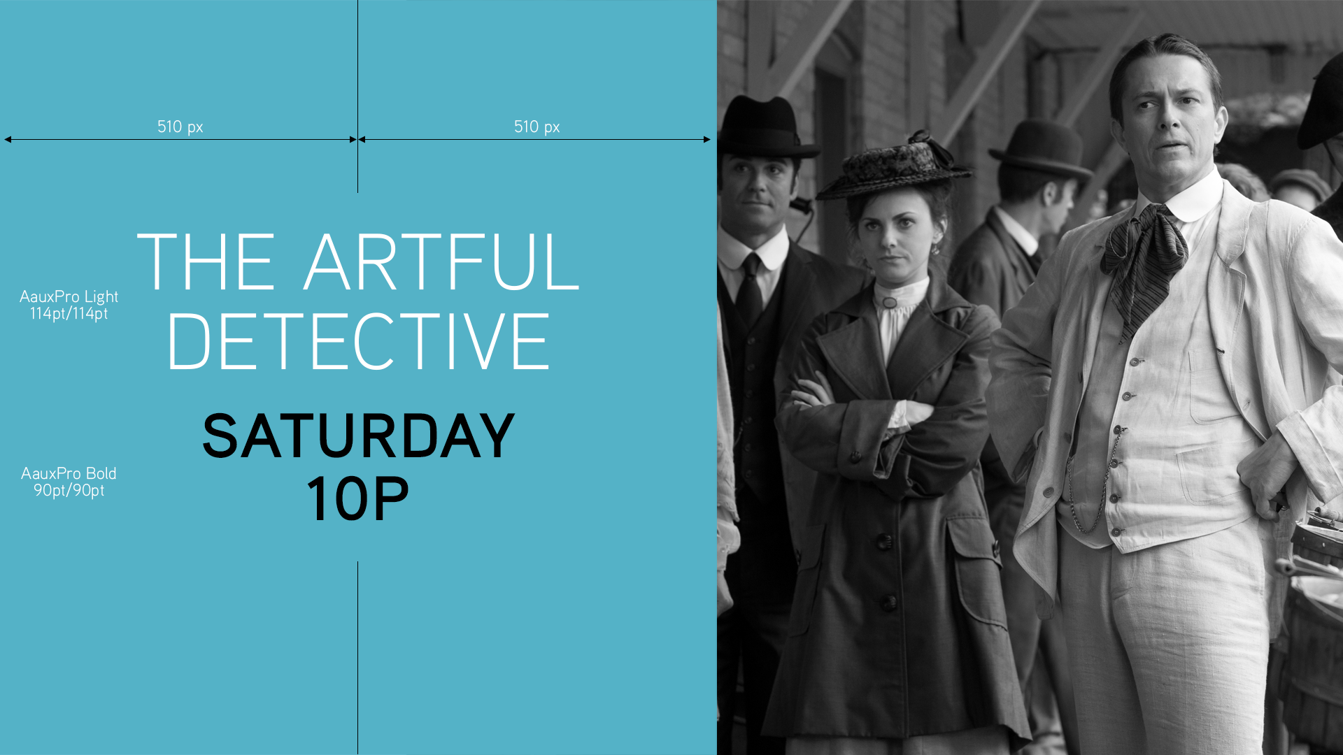
The old package was dark, depressing, and structured to the point that the design team had zero flexibility. It was tasteful, but too safe. Footage elements were not addressed in any meaningful way and and the color palette lacked consideration. Motion had been established by way of a templatized branding package and there were no opportunities to break from it or experiment. As a result, everything looked the same and shared the same format. An updated package needed to express humor, playfulness, and energy, while establishing basic rules for layout, design, and footage treatment.